
The Evolution of Romance Book Covers
We aren't supposed to set much in store by the cover, but when it comes to romance I think cover art is a huge part of communicating the book to prospective readers. Like a perfume ad, a romance book cover needs to evoke specific and powerful emotions, and they have evolved their own coded communication to suggest aspects of the stories to. Romance books and their covers have evolved to reflect changing attitudes to relationships, sex and female desire.
Romance Serials
In the 1920s, romance serials were distributed like bootleg liquor in brown paper. According to Romance Archivist and Historian Steve Ammidown, the modern romance cover can be traced back to True Romances, a popular UK magazine featuring a painted couple on its cover. Liquids harks back to this era in its composition; a tight close up shot of a couple in profile.
 |  |  |
Magazine ARtist Influence
As the magazine world increasingly began to favor photography over painting, illustrators like Frank Kalan migrated into publishing. Artists like Robert McGinnis (whose art defined Sean Connery's bond era posters) brought a combination of classical art training, advertising nous and a cinematic eye for punchy poses to the romance genre. Pop art also influenced romance, particularly with the rise of graphic novels.
The "clinch" cover

In the 1970s and 80s, the oil painting style continued - but we were now firmly in a post-sexual revolution world, and female desire was exploding onto the mainstream. The romance genre was responding; enter The Bodice Ripper; sweeping historical romances featuring dubiously consensual encounters, men with more red flags than a beach in a hurricane, and lots and lots of sex.
To sell this heightened romance, cover artists depicted passionate embraces with scantily clad men. The watershed came in 1980, when McGinnis painted the first ever naked romance cover man on the cover of Johanna Lindsey's Fires of Winter in 1980. Many of these "Clinch" covers featured Italian model Fabio Lanzoli (an Italian model and diva who frankly deserves his own blogpost!) and some pretty heavy-handed innuendos...

The Step-back cover
I love a sexy romance as much as the next girlie... but what if I don't want everyone on the subway to know that? Enter the step-back cover: a saccharine front cover opening up to reveal, well, anything but. Artists like Elaine Duillo (who painted the above Fabio masterpiece) objected to their work being hidden away: but what's a shy reader to do? Some of my favorite more modern step-backs are Max Ginsburg's paintings for Julia Quinn's original Avon Bridgerton Series editions, pictured below. Aside from the rippling abs, can we have a moment for the painting?! He's got the soft-focus starlet filter down pat!
 |  |
Chick Lit
In the 90s, the rise of "chick lit" gems like Waiting to Exhale, Bridget Jones' Diary and Sex and the City brought modern realism to the world. We could have sex and a career and kids - albeit less Carry Bradshaw and more Kate Reddy in I Don't Know How She Does It. Their covers were cool, relatable and tended to focus on the protagonist (rather than a shirtless love interest!). Bringing female desires out of the possible and into the real world spelled the end of the stunning but pretty unrelatable romance cover, even if its influence took a good decade to come into effect.
Realistic Romance Covers
By the late 2000s, the digital age was in full swing and millennial grey was looming large. Romance book covers (including my own) took a turn for the photorealistic. Series like Twilight and 50 Shades of Grey employed single object images, pops of color against dark backgrounds. Liquid's dramatic color scheme reminds me very much of this book-cover era!
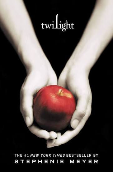 |  |
However, shirtless man photos have their downsides - I find it immensely annoying when the chap on the cover looks nothing like the one in my head! Where Twilight would use interesting apples and chess pieces to get round the prescriptiveness issue, historical romance went through a phase of headless ballgown covers, so readers could imagine themselves in the heroine's shoes (or regency dress).
Illustrative Covers
Nowadays, romance covers are trending back towards an illustrative style. Elle Kennedy's updated covers for the Off Campus Series reflect this shift; no more headless Tumblr girl, it's all foot popping on the ice!
 |  |
Playful covers also reflect the greater integration of romance with chick lit. Contemporary romance often includes comedic elements, and a greater focus on fully-fledged characterization and (dare I say it) plot. Romance tends to be something both MCs have agency in, rather than something thrust upon an unsuspecting heroine. Marketing Manager Jane Nutter: "people are gravitating towards the female gaze of it".
While some people are not a fan of twee illustrative covers for steamy romances, they certainly increase readability. According to editorial director Cindy Hwang, Jasmine Guillory's 2018 novel The Wedding Date "caught the eyes of lots of non-traditional romance readers" with it's bold graphics and regency-throwback silhouettes. I think that an intentionally exaggerated cover can also just be a bit of fun. It signals that the book doesn't take itself too seriously and allows the reader to lean into the joyful parts of romance.
 |  |
Final Thoughts on Romance books and their Evolution
No matter how fantastical the plot or setting, romance as a genre is hugely reflective of existing social attitudes towards women, and what we are allowed to want for ourselves. Sea changes in our professional and sex lives are reflected in their contents and on their covers. Reading romance means interacting with that heady, complicated world of desire. Romance book covers are both doorways into that weird and wonderful world, and a fun, decorative, safe wrapper for it.
Which romance covers are your favorite? Drop your thoughts in the comments below!
Love, Eve x
#RomanceBookCovers #BookCoverDesign #RomanceHistory #CoverArtHistory #RomanceBooks #BookCovers #PublishingHistory #RomanceReaders #BookBanning #PulpFiction #IllustratedCovers #CoverEvolution #RomanceCommunity #BookDesign #RomanceNovel #BookHistory #RomanceGothic #ClinchCovers #RomanceTropes #BookTok #Bookstagram #CozyRomance #VintageRomance #BookArt #RomanceAuthors #HistoryOfPublishing #RomanceGenre #IllustratedRomance #BookTrends #LiteraryHistory


Comments